- hello@virtuallyuntangled.com
- Monday - Thursday 7:00am - 3:00pm (CST)
Yes, Colours Matter. But What Do They Mean?
From a business standpoint, colour can influence a person’s mood as well as their general attitude towards your brand. In this sense, your colour palette should always be something to consider as anything that influences how people responses can be pivotal to your success (or even lack thereof).
Now back late last Summer we dug deep into Does Colour Really Matter. So, today I’d like to keep that in mind with taking things a step further into why colour choices matter.
Did you know that colour increases brand recognition by 80%?
All colours of the world fit into three small categories: cool, warm and neutral. While you can select all of your colours from within the same group, it is often possible to achieve a powerful effect by introducing a colour from one of the other groups. Interested to know more about what I am talking about …?
Let’s take a deeper look at how colours work together, what each colour means and how you can use thins information to build and strengthen your brand image …
COOL Colours:
This range of colours tend to have a calming effect on the viewer. When used alone these colours can have a “cold” or even impersonal feel. So, when choosing from this colour range, it would be wise to add a colour from another group to avoid this type of feeling and add some warmth to your palette.
WARM Colours:
This range of colours tend to have an exciting effect on the viewer. When used alone they can overstimulate and sometimes even generate emotions around anger and violence. So, when choosing from this colour range, it would be wise to add a colour from another group to avoid this type of negativity and add some balance to your palette.
NEUTRAL Colours:
This range is great because they can be mixed with both cool and warm colour palettes. They are great for design background and tone down boldness in other colour options. Black is added to created a darker shade while white is added to create a lighter tint. Neutral = Balance = Happy.
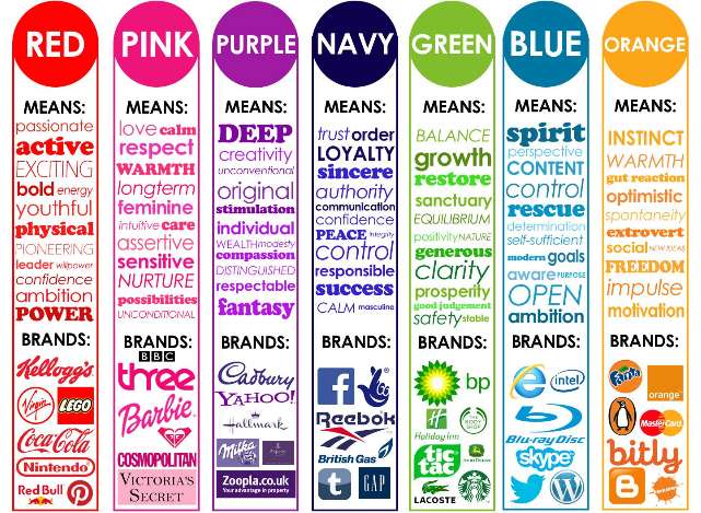
Now that your mind has been filled with colourful insight and ideas. Here’s a simple infographic curtesy of Visual Modo to put things into perspective graphically by colour …
While there is no absolute right or wrong way to choose colours for your brand, you do need to understand your target audience and consider how they will respond to your colour choices. If your end goal is for them to choose YOUR business or product, then your colour palette must appeal to them in every possible way. There are overall factors that indicate what your audience may or may not like, such as: age, gender, trends and class.
Choosing colours is more than just picking what “feels good” to you, it is all about creating a response from the viewer and by knowing your target audience and the effect that different colours can have, you gain a greater ability to determine what colour options will work best.
So, is the choice of colours for your bran more than just a personal preference?
Does it truly matter what colour choices you make for your logo and brand?
Will your audience really feel differently because of the colours you have chosen?
The answer to all of those questions is YES! Colours do matter!
Like this blog post?
If you found today’s blog post to be exactly the type of inspiration and know-how you were looking for, we would be very grateful if you would help this post spread
by sharing the LOVE  with it socially, emailing it to a friend or dropping us a comment with your thoughts. You never know whose life you might change.
Share on Facebook
Share on Twitter
Share on Linkdin
Share on Pinterest

Crystal Kordalchuk
Crystal is an artist, a writer, an organizer, a dreamer, a doer, and down-right proud of it NERD!.
Struck with a love for #AllThings creative at a very young age, Crystal dreamed of a life fueled by her passion for creating and bringing the stories and images in her mind into reality.
As she worked toward her dreams, she earned a diploma as a Computer Applications Specialist then another in Graphic Design and from there began to develop her extensive background in multimedia and the arts. She began her worked in the magazine industry as a layout designer and had a succession of design jobs thereafter. It was her role as a graphic/web designer that gave her the first real glimpse of her future. Soon she began a side job as a freelance designer while keeping one foot in the corporate world. A spark was lit! She turned her freelance gig into a full-time business combining design work with her other passion: creating organization from virtual chaos.
Crystal is one of the most organized individuals on the planet. She is by all means a Zen master of her crafts. She excels at helping others become “untangled” and provides her clients with tools to run their businesses smoothly while she takes care of the details behind the scenes. Thus Virtually Untangled was born. A successful business where her work as a top notch creative in graphic and web — with a twist of virtual assistant — married into one amazing place where clients can come with their virtual messes and become magically untangled. Crystal can always make sense of even the most unorganized chaos and offers a virtual detox of order and peace, so her clients can get busy doing the work that they love the most.