- hello@virtuallyuntangled.com
- Monday - Thursday 7:00am - 3:00pm (CST)
The 10 Commandments of Graphic Design …
Well entrepreneur friends, it’s Monday and I’m back with part 2 of my “Christmas in July” — end of the month commandments miniseries. Last week we dug deep into some nerd knowledge of the 10 commandments of writing and I thought what better then to talk about graphic design next!
Whether you’re a graphic designer or not (I know some of you keeners are DIY’ers) these commandments are good for everyone to know. Even if you have a designer on your team. Now you will have more insight to what they’re creating for you brand and whether it’s “how it should be”. So, let’s not waster anymore time and just dive right on into the goodies!
Commandment #1: Never use clipart or word art when trying to make a statement.
You want your brand to be original and stand out, right? And, you want your audience to remember you for the empowering brand you show forth to the world, right? Well, when you are going for originality (which everyone is/should be), clipart and word art images are an absolute huge no-no in design-land. They not only look bad but sabotage your brand’s identity by saying “Hey, we didn’t have time (or care enough) to come up with something unique and creative to what our voice is trying to say so we hopped on the Google-train”.
Yes, I know … clipart and word art are free. But there’s a fine line between free and saving time and doing things right. If your budget is tight or you just plainly want to do things yourself try something like Canva.
So, please oh please, stay far away from these choices as much as possible. Pretty much at all if you take pride in your brand. And, If you want (or need) professional help there is always someone, somewhere who can help.
Commandment #2: Never (ever) use images without attribution.
This one is simple and not hard to follow … if something doesn’t below to you, make it clear. Don’t be “that guy” (or gal) going around, stealing graphics from the ends of the earth and not crediting the actual artist. Most stock photo sites make it super easy to offer an attribution for each file downloaded so there really is no excuse.
Commandment #3: Never (ever) use under-quality, grainy imagery.
This one follows in line with #1 and #2 … So, you’re doing a happy dance because you just found the “perfect” stock photo for your document, website, whatever … but it needs to be larger. So, you stretch it to fit the size needed. Ehhh, wrong! Any time that you stretch a raster image larger (an image that is full color and is not a vector), your image will start looking grainy and blurry. Almost nothing ruins a professional design worse than grainy images.
The internet is a huge place… take the time you need to find a similar image that is large enough for your needs. Making an image smaller is always ok. Or, if you have the pleasure of working in Photoshop, you can check the size of your artwork at 100% (or view print size) to make sure everything looks crisp.
Commandment #4: Honour they whitespace.
In today’s day-in-age they say content is king, so this makes us often tempted to put down every bit of information we have on everything we put out with our brand’s face on it. Which brings me to this very important tool in every designer’s virtual tool bag, white space. So, to cut to the chase, the basic rule of thumb here is the more white space, the more clean, sophisticated, modern and organized your design will feel. Your content will immediately become easier to digest and feels more organized. Less is more, people. Less is more!
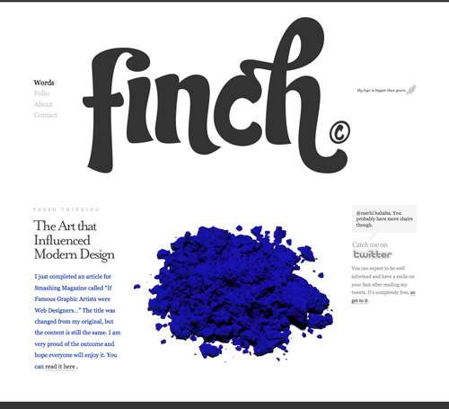
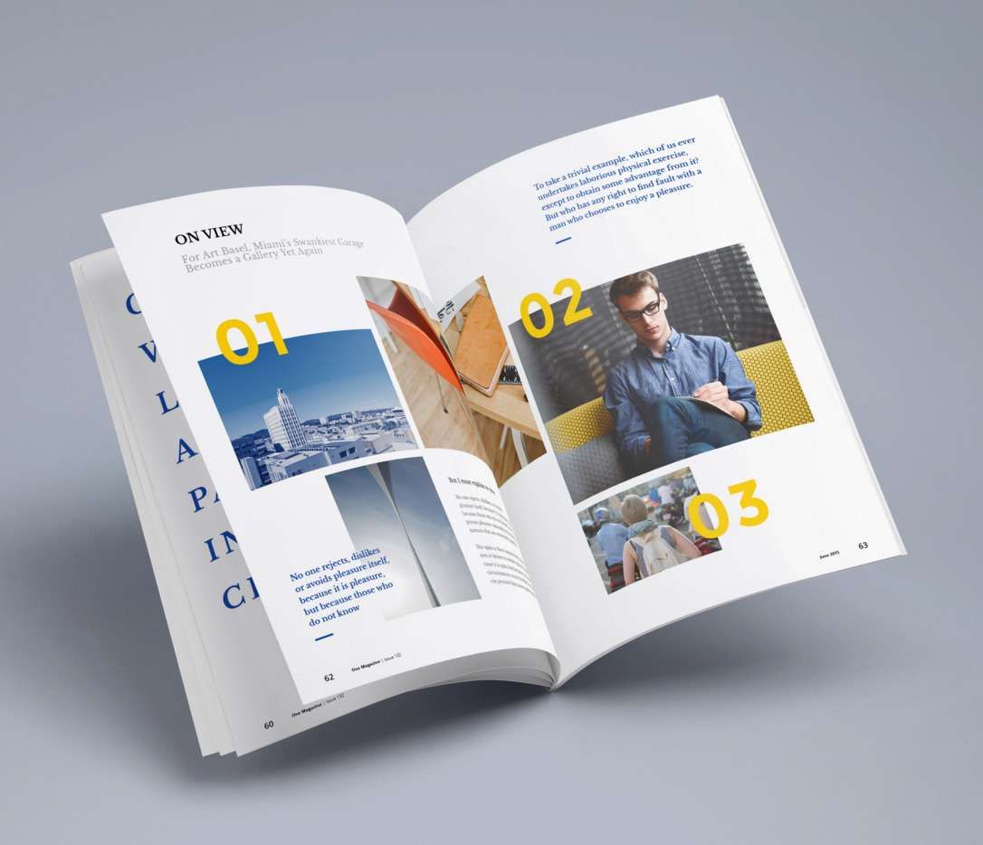
Not sure what I mean?! Below are a few really great examples to get your hamster wheel going …
Commandment #5: Proofread before going viral.
This is a common error in design-land as sometimes not all designers are writers and not all writers are designers. So, try not to rely on your spell checker too much. Your computer can do a lot to help you out, but if you use the tools at your disposal without thinking or double checking your work on your own, you could find yourself in big trouble with an error you may not be able to go back and fix. So please, proofread. Then read it again, and again.
Trust me, you do not want your branded designs to go viral for all the wrong reason! One teeny tiny typo can make the difference to what you audience is trying to remember you for. A good example, that I saw recently was the difference between an Angus burger … well, and something entirely different. I would hate to be the designer on that end of the conversation. LOL!
Commandment #6: Consistency is key … the golden key.
The information you share with the world should reflect your brand. Therefore, you need to have a consistent style, colour theme, typefaces (remember … never more than 3 outside of the “family) and tone of voice. Don’t be afraid to be creative with your visuals – and your writing — to keep your audience engaged and coming back for more. Just make sure you are keeping things consistent throughout all means of communication.
Commandment #7: Steer clear of fads and clichés.
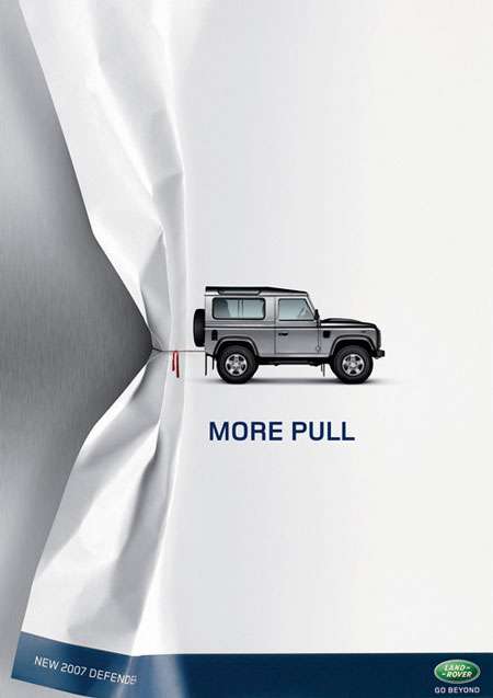
It’s always fun to gather around the metaphorical water cooler – or virtual in most of our cases — and jest about all the exciting new things in the land of online marketing. However, just like fads in clothing, these brand design ideas tend to take the same motion. Meaning they’re here for a good time, not a long time. Another common cliché comes in versions of logos. And to avoid falling into the pit, here’s a really great infographic about some basic questions to ask yourself (curtesy of DesignContest.com) …
Commandment #8: Use smart font choices.
Every single font has its own personality, just like people. So how do you make this work?
Well, start by knowing your target audience, your document’s purpose and then go on to find a good font choice that matches these expectations – but also follows your brand standards (re: style guide). A single font choice can either make or break your brand/document. So, if you happen to be using a default font, you are showing the world that you don’t know about any other options – or are just too lazy to find any.
Go back and think about font personalities, your audience and what you’re trying to achieve with this branded document. In most cases, there is always something better than the default choices (e.g. Times New Roman, Calibri and Arial, just to name a few). If you’re reading this and stuck on ideas or just starting to build your brand, here is a blog post from last year that showcases my TOP 25 favourite fonts – and places to find some other good ones — to get the ball rolling!
Commandment #9: Be punctual with your punctuation.
Punctuation can have a powerful visual impact with your audience. Make sure to use apostrophes correctly and know where to place quotation marks. Use a hyphen for compound adjectives and make sure you know the difference between a colon and a semi-colon. Use commas to indicate nonessential information and if ever in doubt, rewrite or use a dictionary. For those of you in Canada, the best resources on this topic would be the Canadian Press Caps and Spelling (21st Edition) and the Canadian Press Stylebook. Both books can be purchased online or at your local bookstore for a very reasonable price and can build your confidence in your writing skills.
Commandment #10: Bring organization with alignment.
Aligning all your elements can of course take some time, but it will bring only bring organization and sophistication to your graphic elements. It will also help your message get across more clearly and consistently because organized graphics are easier for viewers to interpret.
Each of these core commandments elements are equally as important as the next. They pull one another together to create a passionate, recognizable and memorable experience for your audience. And when done right, brings you and your business nothing but happiness followed by leads.
So, do you now feel your brand needs more?
By listening to your story and vision, and your ideas on how you want to make your bigger picture a reality, I can help you shape your brand, elevate your logo (or graphics) and help you portray your business to your target market more effectively. So, feel free to drop me a line so we can strategize about how to begin “untangling” your business’ design needs.
With this in mind I only have one more thing to add … The Golden Rule in design-land, consistency leads to recognition and recognition leads to trust.
Just a quick note before we all continue on our solo-preneur adventures for the day … this post is the second of four in this end of month miniseries. Nerdy Christmas in July. LOL! So, stay tuned as this coming up Thursday I’ll be diving into a really big one (Web Design) then back again next Monday with the last part of this miniseries. Saving the best for last of course … You won’t want to miss that one either.
Like this blog post?
If you found today’s blog post to be exactly the type of inspiration and know-how you were looking for, we would be very grateful if you would help this post spread
by sharing the LOVE  with it socially, emailing it to a friend or dropping us a comment with your thoughts. You never know whose life you might change.
Share on Facebook
Share on Twitter
Share on Linkdin
Share on Pinterest

Crystal Kordalchuk
Crystal is an artist, a writer, an organizer, a dreamer, a doer, and down-right proud of it NERD!.
Struck with a love for #AllThings creative at a very young age, Crystal dreamed of a life fueled by her passion for creating and bringing the stories and images in her mind into reality.
As she worked toward her dreams, she earned a diploma as a Computer Applications Specialist then another in Graphic Design and from there began to develop her extensive background in multimedia and the arts. She began her worked in the magazine industry as a layout designer and had a succession of design jobs thereafter. It was her role as a graphic/web designer that gave her the first real glimpse of her future. Soon she began a side job as a freelance designer while keeping one foot in the corporate world. A spark was lit! She turned her freelance gig into a full-time business combining design work with her other passion: creating organization from virtual chaos.
Crystal is one of the most organized individuals on the planet. She is by all means a Zen master of her crafts. She excels at helping others become “untangled” and provides her clients with tools to run their businesses smoothly while she takes care of the details behind the scenes. Thus Virtually Untangled was born. A successful business where her work as a top notch creative in graphic and web — with a twist of virtual assistant — married into one amazing place where clients can come with their virtual messes and become magically untangled. Crystal can always make sense of even the most unorganized chaos and offers a virtual detox of order and peace, so her clients can get busy doing the work that they love the most.