- hello@virtuallyuntangled.com
- Monday - Thursday 7:00am - 3:00pm (CST)
Businesses Who Launched a Successful Rebrand …
In every business, no matter the size, there comes a time when the shiny luster has worn off and the business owners begins to wonder if their brand is doing them more harm than good. Even huge industry giants (such as Pepsi, Apple, Starbucks) take some time every so many years to rethink their brand.
When it comes to rebranding, the first thing many people think of is a shiny new logo. During a rebrand, businesses often change marketing visuals for both their print and digital marketing to achieve a fresh and exciting new look. However, a good rebrand goes beyond the logo. Here is a list of businesses that I feel have launched a successful rebrand over the last handful of years …
budweiser
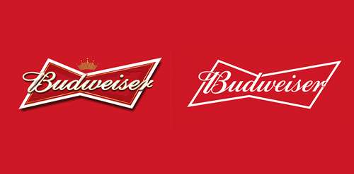
The logo has been stripped back to a simple curvaceous script typeface (created by Ian Brignell) which is layered on top of a crisp white bow line. The new packaging is visually stunning and bold. The logo is given acres of space to breathe and it’s allowed to gloriously wrap beyond the visible edges of the can. The tightly cropped and oversized elements of the can design have been rolled out across all packaging. It is a very confident, proud look that doesn’t rely on gimmicks.
jack in the box
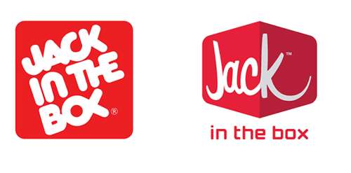
The old logo had all the fixings of a “classic American fast food chain” with the red and quirky typography. Plus, years of equity. The new logo is a very contemporary departure from the original, which is par for what’s been happening to fast food logos and the new, custom script is quite attractive and dynamic. The old flat square has been replaced with a box seen from the front with a marked perspective on which the lettering wraps, and in the actual signage, the corner of the box sticks out, which is a nice detail. It is a very huge change that will the company will benefit from greatly in today’s modern society with a love for fast food.
google chrome
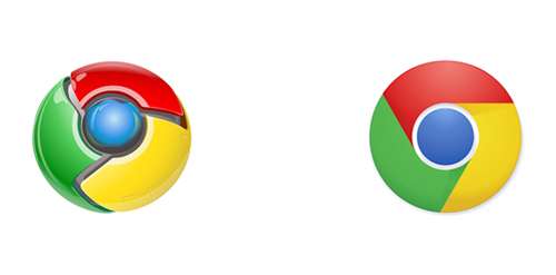
The Google logo has always had a simple, friendly and approachable style. Google wanted to retain these qualities by combining the mathematical purity of geometric forms with the childlike simplicity of schoolbook letter printing. Their new logotype maintains the multi-colored of their previous mark — a reminder that we’ll always be a bit unconventional. As the design evolved, engineering developed a unique approach for asset generation, version control and self-service distribution. Personally, I think the removal of the previous logo’s tacky 3D effects is a step in the right direction. Yet another win for simplification.
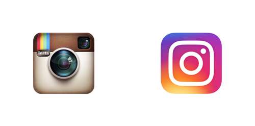
The skeuomorphic camera icon that has accompanied Instagram until 2016 was a modern-day classic. Not because it’s good — but because of its omnipresence in users’ phone screens. I bet it’s on the home screen of 99% of people who have the app and who tap it very regularly. Their new logo is all about flat design with a dash of optional gradients. Now, as far as camera icons go, this is quite lovely and has the minimal number of elements necessary to be recognized as a camera BUT not the minimal number of elements necessary to be recognized as Instagram.
airbnb
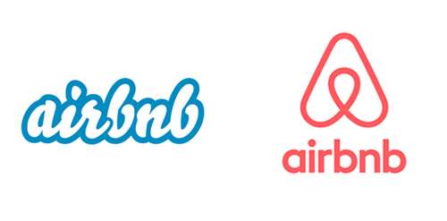
With Airbnb’s new logo they set out to create a top-to-bottom transformation of their previous brand to reflect the growing global audience. Part of their goal was to design a marque anyone could draw– something that transcended language and formed the foundation of the new brand. The marque encompasses values of belonging and is imbued with four meanings of people, places, love and Airbnb. This is transcended into a community symbol that can be expressed differently by each community member and in every listing — it is not bound by language, culture or location. The end result is a symbol to make people feel compelled to share. One that accepts that we are all different with an aim is to create a universal symbol for the company.
animal planet
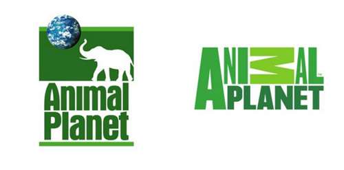
The Discovery Network’s Animal Planet channel has launched their new logo, with a “missing” M that will be replaced by a series of animals and presenters across a series of ads, idents and bumpers. Their creative strategy behind the bold new identity was to bring our surprisingly human brand promise to life, observing how animal behaviour often reflects human behaviour, providing an entertaining insight into the nature of our programmes, which are about people as much as animals. Genius if you ask me!
starbucks
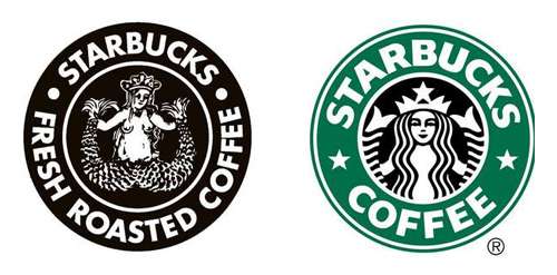
When Starbucks announced their new identity in 2011, during their 40th anniversary year, removed that outer strip so that there is no longer a mentioned of “Starbucks” anywhere (as well as the obvious naked merman being removed). This to me, was an incredible gutsy move. Their surprising new bright green on the cup holder, added a nice touch of vibrancy — and everything falls in place with the idea of evolution. Their new look is very eye-catching without all the clutter of various distinct colours. When a green and a white logo is all you need to become instantly recognizable – you know you have created something successful.
dc comics
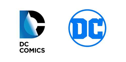
This rebrand has come long and far as their new logo is a mark that leverages over 80 years of heritage with an eye toward the future which celebrates their brand’s past, present and future. Their launch (back in 2016) was the perfect tribute to their legacy, exciting future and most importantly … their fans. One of the many benefits of the new logo design is its versatility to showcase DC’s iconic and timeless characters and stories across all media. Their new logo is a throwback to their 1970s logo but with a new chiseled monogram with collegiate blocky lettering. There are hundreds of ways to render “DC” in a circle and but to me, this logo feels like is has enough “flat area” to work with as a window structure (which I am sure we will see eventually in one form or another). I know for all the huge DC fans out there it’s a bit of a controversy as they feel it’s “too plain” and “boring”. But to me, from a designer’s point of view … it’s clean, it’s crisp and that’s alright by me!
Like this blog post?
If you found today’s blog post to be exactly the type of inspiration and know-how you were looking for, we would be very grateful if you would help this post spread
by sharing the LOVE  with it socially, emailing it to a friend or dropping us a comment with your thoughts. You never know whose life you might change.
Share on Facebook
Share on Twitter
Share on Linkdin
Share on Pinterest

Crystal Kordalchuk
Crystal is an artist, a writer, an organizer, a dreamer, a doer, and down-right proud of it NERD!.
Struck with a love for #AllThings creative at a very young age, Crystal dreamed of a life fueled by her passion for creating and bringing the stories and images in her mind into reality.
As she worked toward her dreams, she earned a diploma as a Computer Applications Specialist then another in Graphic Design and from there began to develop her extensive background in multimedia and the arts. She began her worked in the magazine industry as a layout designer and had a succession of design jobs thereafter. It was her role as a graphic/web designer that gave her the first real glimpse of her future. Soon she began a side job as a freelance designer while keeping one foot in the corporate world. A spark was lit! She turned her freelance gig into a full-time business combining design work with her other passion: creating organization from virtual chaos.
Crystal is one of the most organized individuals on the planet. She is by all means a Zen master of her crafts. She excels at helping others become “untangled” and provides her clients with tools to run their businesses smoothly while she takes care of the details behind the scenes. Thus Virtually Untangled was born. A successful business where her work as a top notch creative in graphic and web — with a twist of virtual assistant — married into one amazing place where clients can come with their virtual messes and become magically untangled. Crystal can always make sense of even the most unorganized chaos and offers a virtual detox of order and peace, so her clients can get busy doing the work that they love the most.