- hello@virtuallyuntangled.com
- Monday - Thursday 7:00am - 3:00pm (CST)
10 Rules of Document Design …
Ok, so graphic design, for those who are not designers like myself, often feels like a difficult task to master. There are what feels like a million “rules” that apply to colours, fonts, white space, layouts, user experience, and so on. It can be a difficult road for those who don’t travel this path often. In reality, designing successful eye-catching documents can be stripped down to just a few basic principles and if you can master those basics, you will be a good, no GREAT, visual communicator even if graphic design isn’t your profession.
Ready to learn how? Then let’s dive in …!
The Importance of Good Colour Choices.
When it comes to colour the world really is your oyster! However, there are a lot of necessary “rules” for lack of a better word, to keep in mind. “Rules” like …
- Less is more (4 or fewer whenever possible);
- Use colour psychology to capture emotions and experiences;
- Use emotion-saturated colours as they grab attention;
- White is nice – treat it like a colour; and
- Use a colour wheel to create matching themes.
Mere colour, unspoiled by the meaning, and unallied with definite form, can speak to the soul in a thousand different ways.
~ Oscar Wilde, Poet and Playwright
The End Goal = Your Audience.
Your end goal is always going to be to share the information at hand effectively with your audience so it’s very, very important to keep in mind who they are, what they do, where they are from and why there are here (meaning reading your document).
Choosing Typography Carefully.
One of your first big decisions on any document should be which typeface you’re going to use. If you have a brand style guide in place you already have your answer. But if for some reason you don’t, here are a few rules of thumb in mind …
- Serif fonts are easier to read in printed documents whereas sans-serif fonts are easier on the eyes when reading digitally.
- If you’re not sure the difference between the two because I’m talking too much design-tech then check this article out!
- If you’re not sure the difference between the two because I’m talking too much design-tech then check this article out!
- Never use more than 3 fonts in one document. Two is preferred.
- However, you can use the entire font family of each (re: one for headings, titles and pull-quotes and one for body copy).
- However, you can use the entire font family of each (re: one for headings, titles and pull-quotes and one for body copy).
- Avoid default system fonts such as Helvetica.
- Increase readability by increasing your line-spacing, shortening your line lengths and using legible font choices.
- Align all paragraphs to the left. You may often be tempted to use justified alignment because that’s what your normally see on printed documents such as novels, magazines and newspapers but it is the wrong choice for business documents. Yes, those straight edges call to you and sometimes even look cleaner but truthfully, it kills readability.
A Picture is Worth Everything.
You’ve heard this a million times … “a picture is worth a thousand words.” Well it’s true. Visual aids can help express the ideas you are trying to communicate more effectively as people tend to remember communications with images up to 70% more than ones without. But of course, not just any ‘ol image …
If you are not using the appropriate resolution for your medium of choice your images will result in pixilation and distortion and your document with automatically lose credibility.
NOTE: 72dpi for digital and 300dpi for print.
Ratios and directions are also important with the photography you choose. For example (re: ratio): when using photos of people, try to increase the size of the face area and remove bodily features to communicate personality. Unless of course your content is heavily speaking about body positioning and/or movement or the specific photo speaks clearly. And this also works just the opposite … to communicate vitality and sensuality, decrease the facial areas and include more of the body. And when it comes to the importance of direction placement, avoid having images of people looking in the direction that takes the audience off the page.
And most importantly … Make sure your photography style is consistent with lighting, colours and positioning. Especially when using multiple photos.
Icons are Important Too.
Icons are small, simple images traditionally used for displaying trends or variations of some type of variable. We use them to make reading quicker and more engaging. They are the universal way to say “Hey, this is important!” If you think about it, they are another pathway-creating visual tool to guide the audience’s eyes (and mind) to specific, intentional and important directions. Just remember to use them smartly and sparingly.
Layout is Everything.
The driving force behind any good layout is to keep it simple because less is more. You want to give purpose and show that everything on the page has a special relationship. Try to avoid those “floating object” that don’t visually connect with anything else. From a design perspective, every single gosh darn thing on your page, within your entire document on every page actually, should be aligned with something else. Strategy is everything including thoughtful placement. And yes, of course your content should be the main focus. However, formatting exists to make that content – your main message – easier to read and digest. Eliminate that temptation to fill the page and introduce eye-catching elements only with good reason and relevance. Maximize that white space.
Which brings me to my next point …
Negative Space = Good.
It’s simple really … Like 1 + 1 = 3 (yes, this is actually correct and not just bad math, LOL).
Negative space is all about paying attention to not only the shapes you are placing on your document but more importantly the space you are creating between certain object. It’s good to start recognizing that every time you place objects together in your design, a third shape has formed between the two. Thus creating 1 + 1 = 3.
You also want to observe that “empty space” with purpose and think of it as a peacekeeper between all elements on your document. If it seems to create unintentional visual noise then it will reduce your credibility. If you think it “feels off”, you are probably right so at the very least … remove it or adjust it until that noise simply floats away and things seem peaceful on your page.
Negative space is the audible silence of the visual world. Never diminish the importance of white space. ~ Unknown
Being Crazy Organized.
Organizing your content effectively within your document is crucial to delivering your message clearly and in a concise manner. You can do this effectively with what is known as the “Five Hat Racks” (LATCH).
The “Five Hat Racks” is organizing your content by location, by alphabet, chronologically, by category or by hierarchy. By using this method of organization your audience will be guided through your most important information first right down to your least important sections of information.
Using Positive Repetition.
Repeat different visual elements within your document but within reason (e.g. sizes, colours, shapes, etc.). You don’t want cluttered chaos. You want clarity and continuity. And of course, your brand to shine (re: your personality). So, I’m going to go back, once more, to remind you of the importance of having a business brand style guide. This will help you make clear and consistent decisions with things like colour, layout, typography, logo use, paper weight, digital images, and so on.
The “Why” Behind it All.
By now, your audience probably has an expectation of what they see from you. That’s a good thing. That means you’ve gotten yourself our there and embedded in their minds by using branding, document genres, colours, font choices, tone of voice, splashes of imagery and so forth which aligns you and your business with what your audience expects and also hopes to see more of. You now want to heighten your credibility through simple yet sophisticated documents but in an in-depth way by reaching them through emotion, logic and timing. It’s all about the timing. So, what’s the “why”?
Having consistent visual language and establishing that instant connection to your main message, product or service. Gaining the trust of your audience. Making a good impression to keep them coming back for more, whatever that “more” may be. The statistics are in … GOOD DESIGN SELLS!
Strong Designs = Trust
Which also equals being memorable to the world in which you showcase it.
Here’s a good example … If your have a designer, they aren’t just going to make your letterhead look awesome all the while being digitally functional, they are going to consider every single aspect of who YOU are, who YOUR COMPANY is, who YOUR AUDIENCE is, what will go on your letterhead (content-wise), what display information is most important as well as least important, what your competitors are up to with this document type (and medium), and the list goes on. Your graphic designer is going to literally pull apart all your content and reassemble it in a puzzle-like way that HELPS YOU communicate to your audience in the best possible way.
Good design is a matter of principle. It starts by looking at the problem and collecting all the available information about it. If you understand the problem, you have the solution. It’s really more about logic than imagination. ~ Massimo Vignelli, Designer and Co-founder of Vignelli Associates
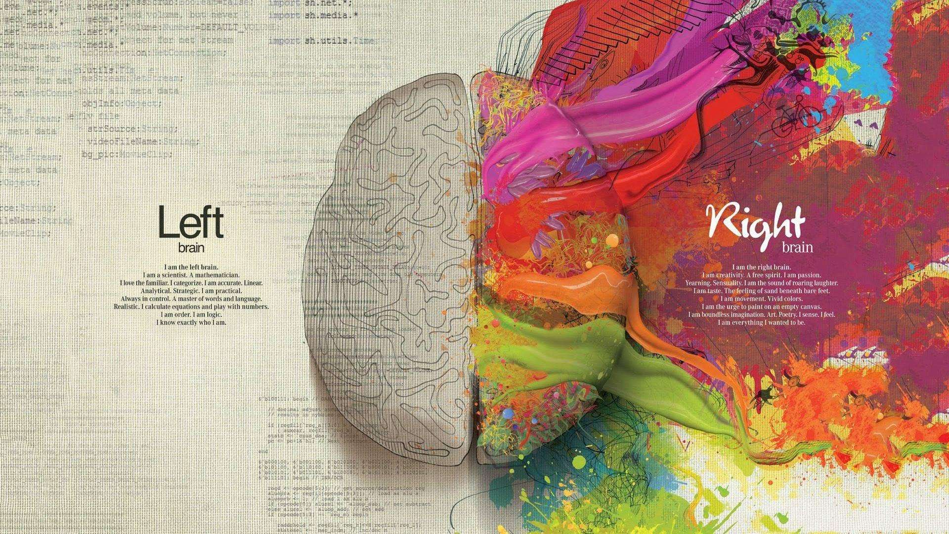
To end on a fun not and dig a bit deeper into the design thinking process it’s really all about having a problem-solving mindset with emphasis on human interaction (and of course applying the principles – re: the “rules” mentioned in this post). It’s all about left and right brain thinking …
Like this blog post?
If you found today’s blog post to be exactly the type of inspiration and know-how you were looking for, we would be very grateful if you would help this post spread
by sharing the LOVE  with it socially, emailing it to a friend or dropping us a comment with your thoughts. You never know whose life you might change.
Share on Facebook
Share on Twitter
Share on Linkdin
Share on Pinterest

Crystal Kordalchuk
Crystal is an artist, a writer, an organizer, a dreamer, a doer, and down-right proud of it NERD!.
Struck with a love for #AllThings creative at a very young age, Crystal dreamed of a life fueled by her passion for creating and bringing the stories and images in her mind into reality.
As she worked toward her dreams, she earned a diploma as a Computer Applications Specialist then another in Graphic Design and from there began to develop her extensive background in multimedia and the arts. She began her worked in the magazine industry as a layout designer and had a succession of design jobs thereafter. It was her role as a graphic/web designer that gave her the first real glimpse of her future. Soon she began a side job as a freelance designer while keeping one foot in the corporate world. A spark was lit! She turned her freelance gig into a full-time business combining design work with her other passion: creating organization from virtual chaos.
Crystal is one of the most organized individuals on the planet. She is by all means a Zen master of her crafts. She excels at helping others become “untangled” and provides her clients with tools to run their businesses smoothly while she takes care of the details behind the scenes. Thus Virtually Untangled was born. A successful business where her work as a top notch creative in graphic and web — with a twist of virtual assistant — married into one amazing place where clients can come with their virtual messes and become magically untangled. Crystal can always make sense of even the most unorganized chaos and offers a virtual detox of order and peace, so her clients can get busy doing the work that they love the most.
